Branding & Social Media
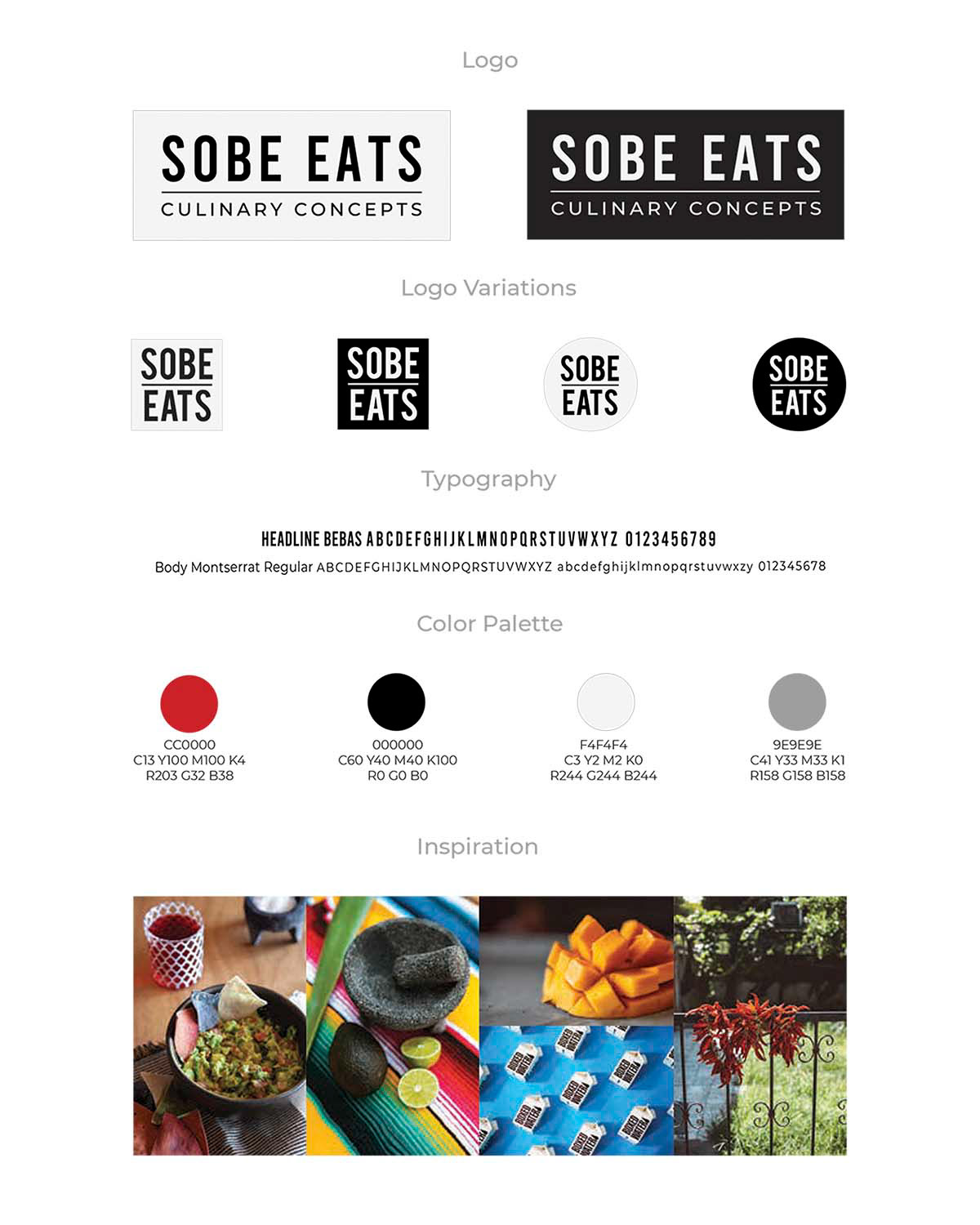
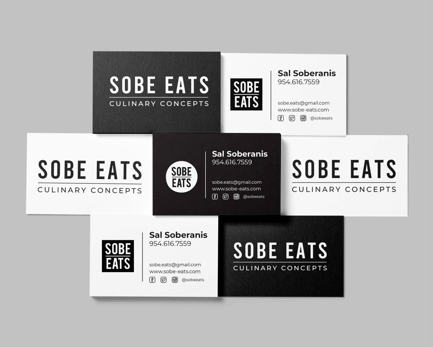
The Soberanis Brothers approached me about creating a logo and brand identity for their recent food truck business. They were getting lots of media attention but they lacked a brand to convey their identity. They were concerned that the media kept confusing their company name. The goal was to create a big, bold, modern brand that thematically conveyed a sense of their Mexican origins and the local, organic, and sustainable sourcing of their food. In the end, we settled on a simple, modern rendering of their company name within a bold circle, square, or rectangle outline. The color palette was simple black and white with red and gray accents to use on their website.
The simplicity of the logo puts emphasis on the food to speak for itself.
The simplicity of the logo puts emphasis on the food to speak for itself.
